If your company has had the good fortune of being around for a while, you may be faced with a decision to rebrand or refresh. What’s the difference?
It’s the go-to move for creative agencies; enticing clients to spend money. For many, it’s included in the very first pitch. Change the logo, change the website and redo everything. After all, it’s the easiest way to generate billable hours! But is it the right thing for your company?
A brand refresh can be as simple as updating your logo, adopting a new slogan, redesigning collateral materials, and a fresh coat of paint in the office. It may include new colors, but it’s primarily cosmetic and doesn’t change how you do business.
However, a rebrand goes much deeper. It’s everything a brand refresh is and more. It means remodeling stores, revisiting mission and vision statements, and even leadership changes. The purpose is to more closely align with customers, avoid market confusion, and create a new personality.
As an analogy, a brand refresh is makeup and a rebrand is plastic surgery. With either, it’s a good idea to revisit your mission and vision. If there are any changes to be made, this is the time.
When is a good time for a rebrand or refresh?
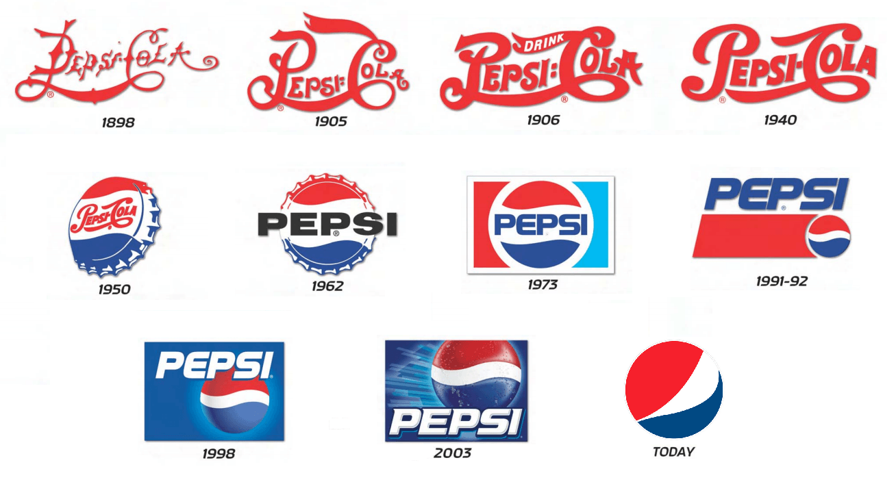
Sometimes a refresh is called for when the “look” becomes outdated and you want to be more in line with the times. It can be tricky because you want to create a brand seen as “current” but also not one that chases trends. Be careful to make changes in increments. Don’t leave any confusion that you are the same company customers have always done business with. In this example, you see how Pepsi has updated its logo over the years.
Notice how they made a significant change in 1945 by adding the “wave” and red and blue colors. Since that time, (with exception of 1951-52) they have kept the image logo familiar with only small variations. In 1953, they dropped the “cola” in the name because customers were abbreviating the name anyway. They had achieved enough brand recognition where they had the luxury of simplifying the name.
Another great example is FedEx. In 1971 the name and logo were chosen to closely align the startup with the government. It conveyed trustworthiness, credibility, and the ability to reach far corners of the US.
By 2000, the name had served its purpose and the company sought to distance itself from the negative association of the word “federal.”
Today, the FedEx logo is known for its brilliant use of negative space. If you look closely between letters E and X, you’ll spot a white arrow. The company says it stands for speed, accuracy, strive for perfection, and perseverance in achieving goals.
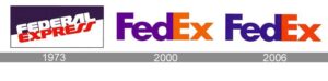
Source: logodix
Yet another more relatable example is from Atlas Rose’s client, Plus Delta. I am their fractional CMO. Previously known as PlusDelta 314, I suggested that they drop the ‘314’ from the name because it served little purpose. The owner had emotional ties to the name, but I pushed back. PlusDelta is a great name. It’s perfect for a company that consults on change management. The meaning of plus delta is ‘adding change.’ When I saw the URL was available, the decision became a no-brainer. The name is strong enough to stand on its own. There is no reason to keep 314 at this point. As marketers, we’re always looking for ways to make things simpler and faster to understand.
Sometimes a deeper Rebrand is called for.
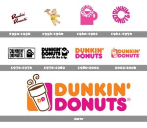
By 2019, the premium coffee market was red hot. Starbucks had proven that Americans were willing to pay $4 or more for a cup of joe. Competitor, Dunkin Donuts had a stronghold on the coffee to go market for years but were ceding new ground to the Seattle startup.
Also around that time, Dunkin Donuts was evolving from the coffee and donut shop to specialty sandwiches, desserts, and other creative menu options. Soon, their business didn’t match their company name. They were more than “donuts” so a rebrand was in order. They are still working with franchisors to remodel 12,871 stores and change signage. For them, it’s an expensive, but necessary maneuver.
Other reasons to rebrand exist too.
For years, Old Spice was the brand of shaving cream and cologne your grandfather wore. The brand had outlived its customers and the market was shrinking. Proctor and Gamble knew to attract younger millennials, they needed to do something drastic. Beginning in 2010, they launched a massive campaign, including millions of dollars in advertising. The campaign was far-reaching and went way beyond a refresh. It included social media, new packaging, and even a new character spokesperson. Old Spice was now fun, entertaining, and masculine. It was a roaring success.
From this: 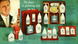 To this:
There can be bad reasons to rebrand too like if a new management team wants to make their mark or the company owner is just bored. Branden O’Neil, of Atlas Rose, CEO of Atlas Rose tells clients that change for the sake of change isn’t a good enough reason for a rebrand or refresh. If it still works, keep it! There are advantages of keeping familiar marks and crafting language that stands the test of time. Brand recognition is the biggest.
Is there anyone reading this that doesn’t recognize McDonald’s “golden arches?” Not likely. That’s exactly why McDonald’s will likely never move away from the likeness they’ve invested in since 1961.”
Healthcare company Johnson & Johnson hasn’t changed their logo since its inception 130 years ago. Why? Because there hasn’t been a reason to.

I recommend getting some outside perspective before you make a major decision like a rebrand or refresh. Sometimes you’re too close to the brand to think about it objectively. Keep an open mind and listen to legitimate business reasons to make the strategy shift. If the reasons aren’t strong enough, keeping the status quo is the right decision. What isn’t acceptable is being hesitant or slow because you fear the work involved. Outsourcing this task along with a full strategy review can be the best effort and money you can spend.
Change can be good. Or not.